Fierté Canada Pride
Logo Design, Visual Brand Identity, Illustrations and Web Assets
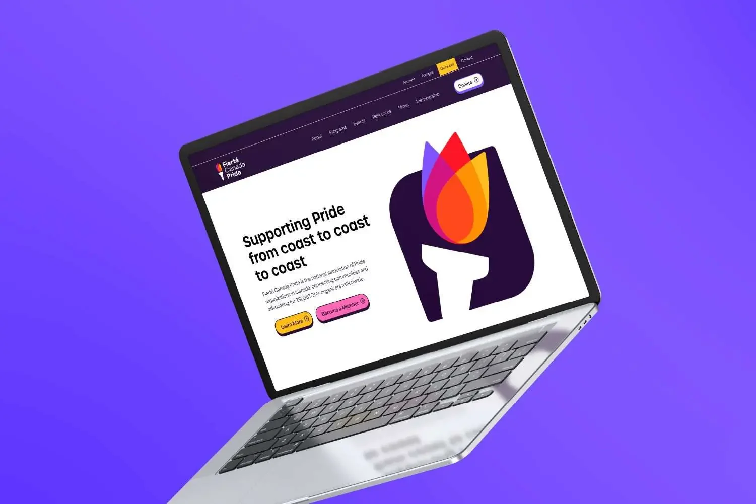
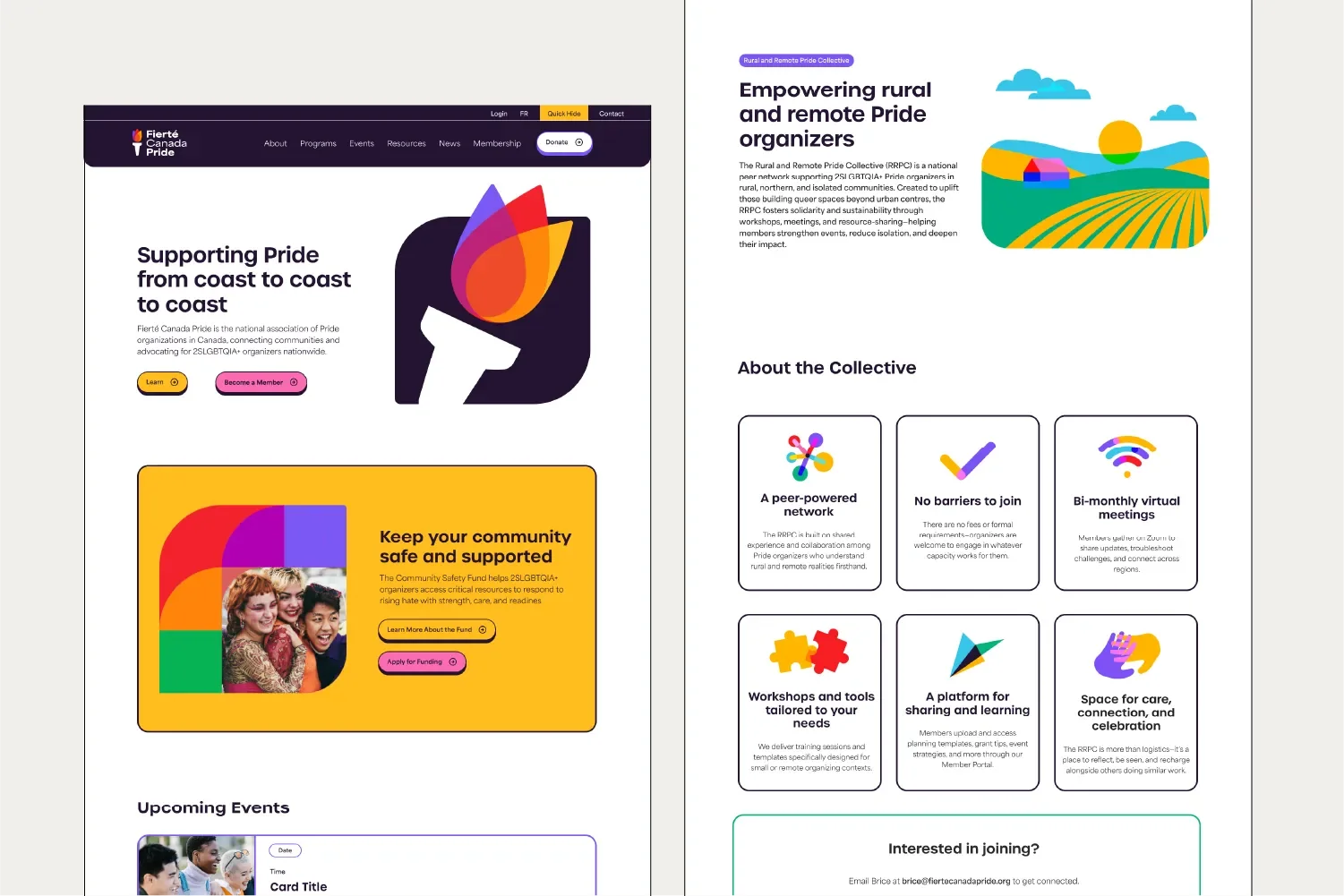
Fierté Canada Pride (FCP) is the national association of Pride organizations across Canada, supporting 2SLGBTQIA+ communities through mentorship, capacity-building, governance, and advocacy. As their impact grew, their existing brand and website no longer reflected the clarity, accessibility, or relational tone needed to support a network of grassroots leaders and equity-seeking groups across the country. FCP engaged Arcana to lead a comprehensive rebrand, story strategy, and bilingual website redevelopment that could meet the evolving needs of their membership.
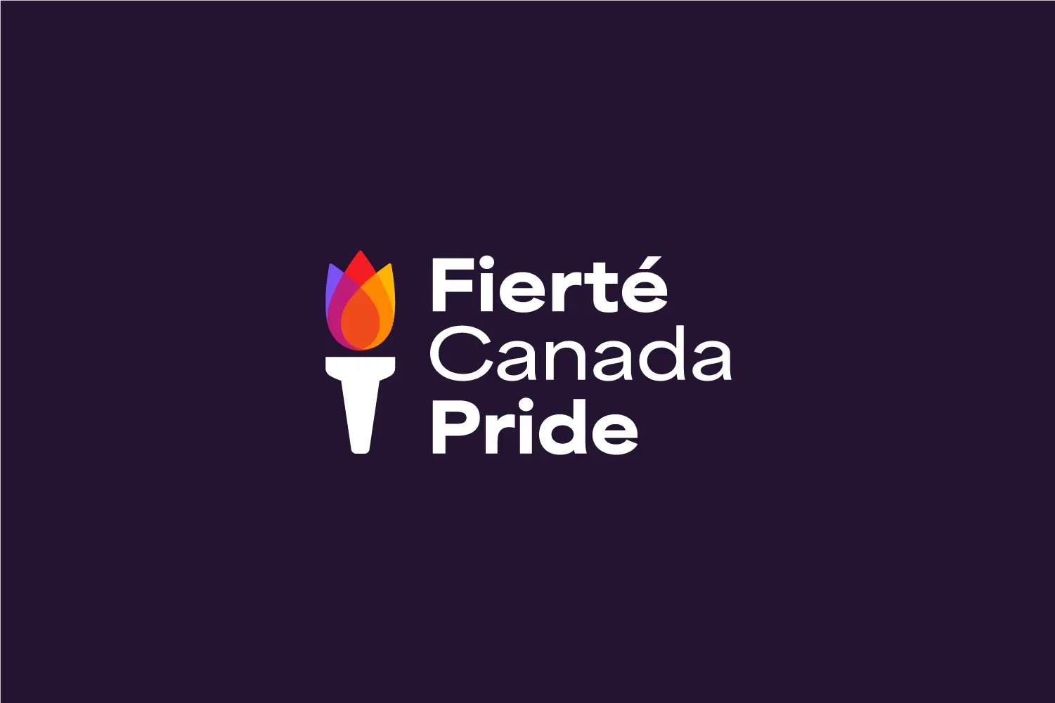
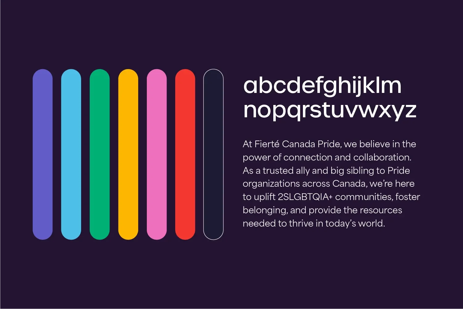
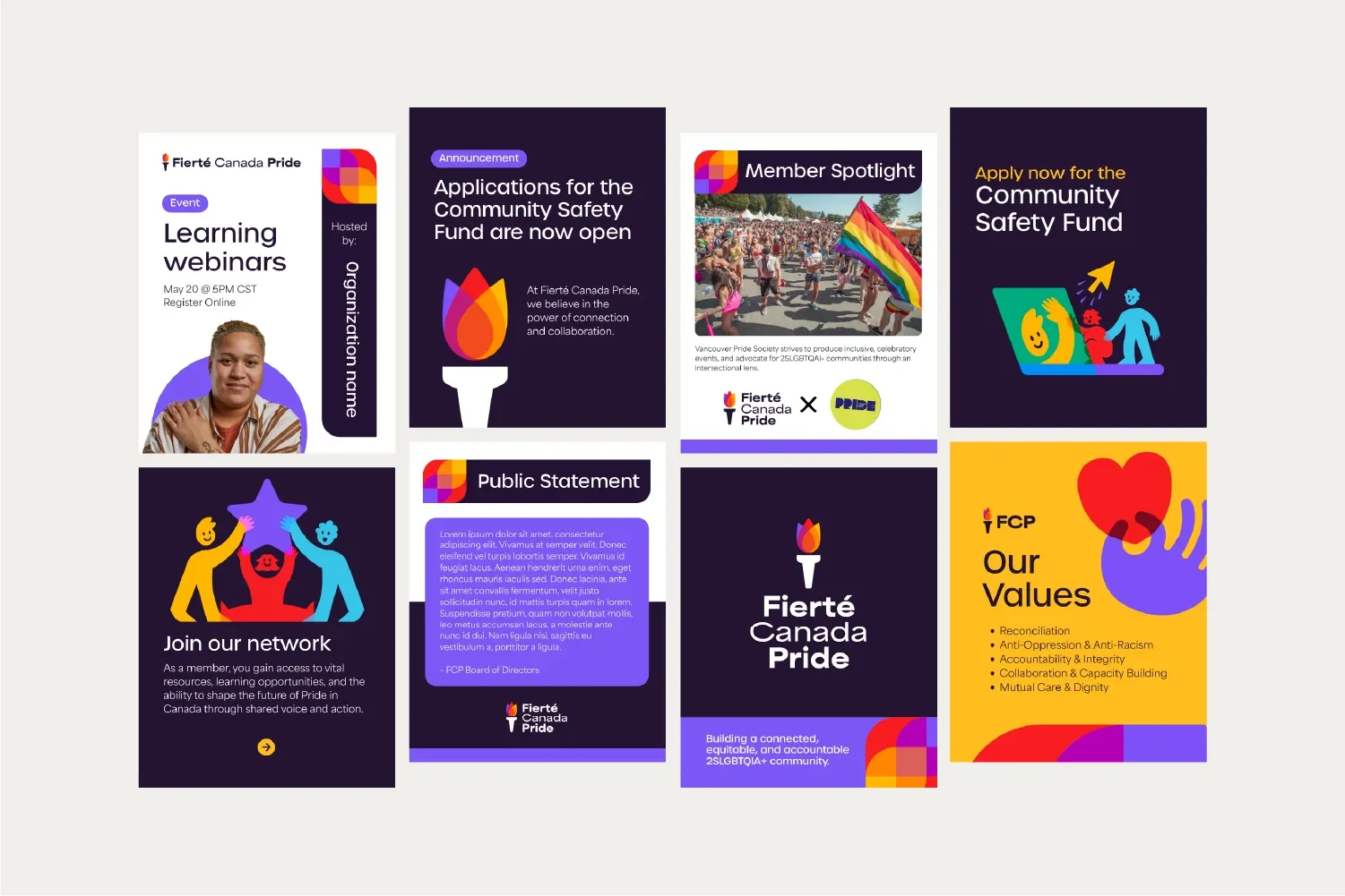
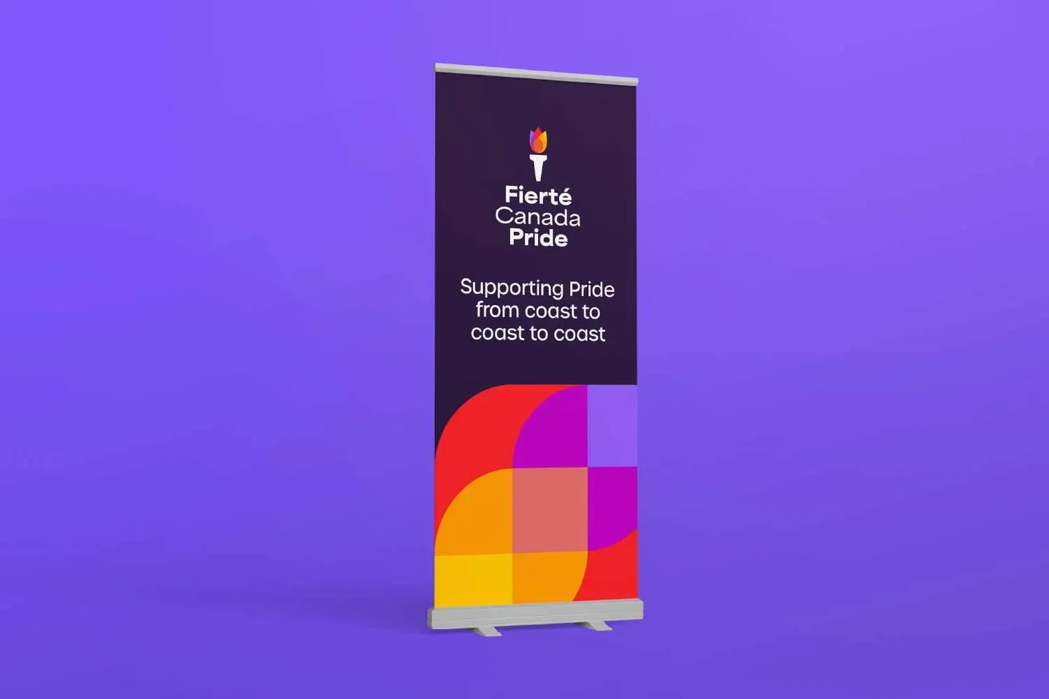
My role in this rebrand, in collaboration with Molly Seaton-Fast, involved developing logo concepts that led to the creation of a torch symbol, which serves as a guiding light for all Canadian 2SLGBTQIA+ communities. Rather than relying on familiar rainbow tropes, the visual system uses layered colour, soft geometry, and adaptable layouts to communicate plurality and connection without flattening difference. Anchored by a rich purple palette associated with healing, dignity, and resistance, and brought to life through overlapping fields of colour that reflect intersectionality, shared space, and collective movement. The brand was designed to work across national advocacy, member support, and internal operations, balancing warmth with strength.
This rebrand was a strategic shift toward a more values-forward, movement-aligned identity that could hold complexity while remaining approachable and human.
Agency: Arcana Creative
Creative Direction and Project Management: Molly Seaton-Fast
Co-Project Management: Logan McManus
Graphic Design: Molly Seaton-Fast, Tim Rees
Illustration: Tim Rees
Web Design: Devon Rathie-Wright, Akshara Dash, Logan McManus
Story Strategy: Rachel Malena-Chan
